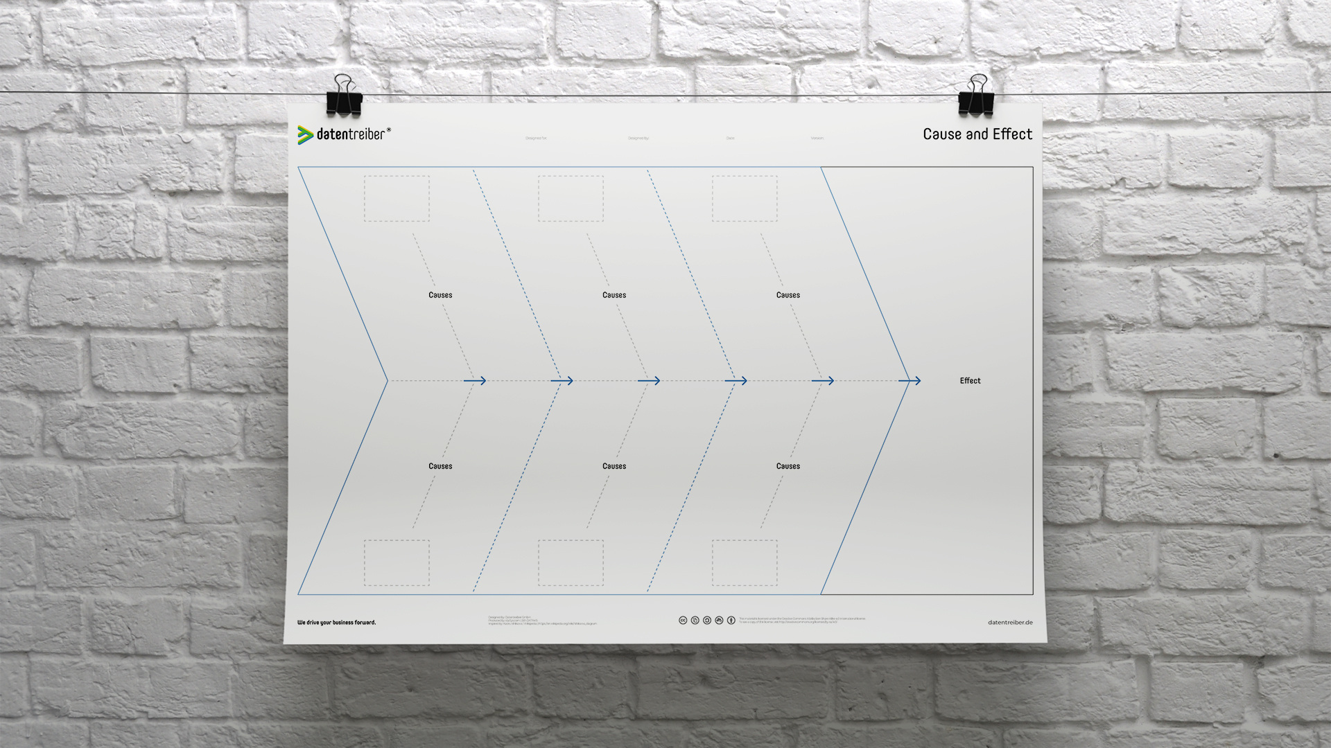
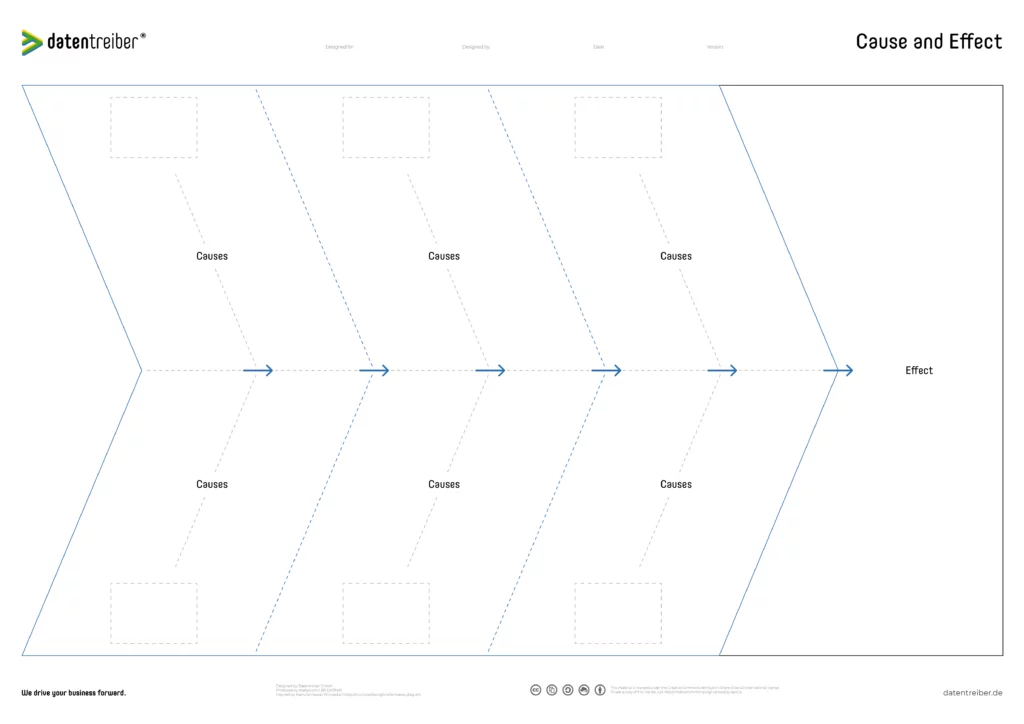
Identify the actual causes of problems and the critical factors to achieve your goals with the Cause and Effect Canvas. The Cause and Effect Canvas also allows you to easily and quickly categorize the causes of errors or success drivers.
The Cause and Effect Canvas is a visual analysis tool for identifying the causes of problems in a team or determining the factors for a desired result, visualizing their dependencies, and grouping the causes or factors into categories. Thus, the canvas supports teams in problem-solving and goal achievement by focusing on the critical causes of problems or relevant success factors.
The canvas is based on the Cause-Effect Diagram by Kaoru Ishikawa and is therefore also known as the Ishikawa Diagram. Due to its visual structure, another common name is Fishbone Diagram.
The Cause and Effect Canvas is available for free under a Creative Commons License: You may use and modify the canvas as long as you specifically mention Datentreiber as the source.
How do I use the Cause and Effect Canvas?
Exemplary use cases for the canvas are:
Start on the right side at Effect, by writing the desired effects (goals, results, etc.) on green sticky notes or the undesired effects (errors, problems, etc.) on red sticky notes. After you have collected the goals or errors, discuss and prioritize the suggestions, for example with adhesive dots or with the help of the Priority Matrix Canvas. Focus on one goal or error and highlight it.
In the next step, collect possible causes for the error (on red sticky notes) or probable success drivers for achieving the goal (on green sticky notes) on the left side under Causes. Dependencies between the causes, i.e., causal dependencies, can be visualized by arrows (on transparent sticky notes), so that secondary and main causes become visible and the filled canvas visually resembles a fishbone.
Finally, group similar causes or success drivers in the six fields (three each at the top and bottom) and name the groups by placing white sticky notes in the fields (with gray dashed line) at the bottom and top under Causes and labeling them with the respective category name. In the Cause-Effect Diagram of the inventor Kaoru Ishikawa, these were the 4M: Man, Machine, Material, and Method. Other so-called main influencing groups can be, for example: Management, Environment, Measurement, and Money. Finally, assign the categories to individual persons or teams so that they can solve the problems or implement the drivers.
You can find additional documents here:
Get to know the method of data strategy design in our practical seminars:
Here you can find more canvas and information on the topic of data strategy design:
You may:
Share — reproduce and distribute the canvas in any format or medium
Edit — remix, change, and build upon the canvas
for any purpose, even commercially.
Under the following conditions:
Attribution
Share under the same conditions
Receive all relevant blog articles, new seminar dates, special conference offers and much more conveniently by email. As a welcome gift, we will send you a link to download our Datentreiber design book (in German) and, for a short time, the article ” Data Thinking: mehr Wert aus Daten” in PDF form after your registration.
By clicking ‘Subscribe to our newsletter’ you agree that we process your information in accordance with our privacy policy.

Wie das mit der von uns entwickelten Methode des Datenstrategie-Designs funktioniert, verrät Ihnen Martin Szugat im Fachartikel im iX-Magazin.
Melden Sie sich jetzt für unseren Newsletter an & wir senden Ihnen den kompletten Artikel in PDF-Form.