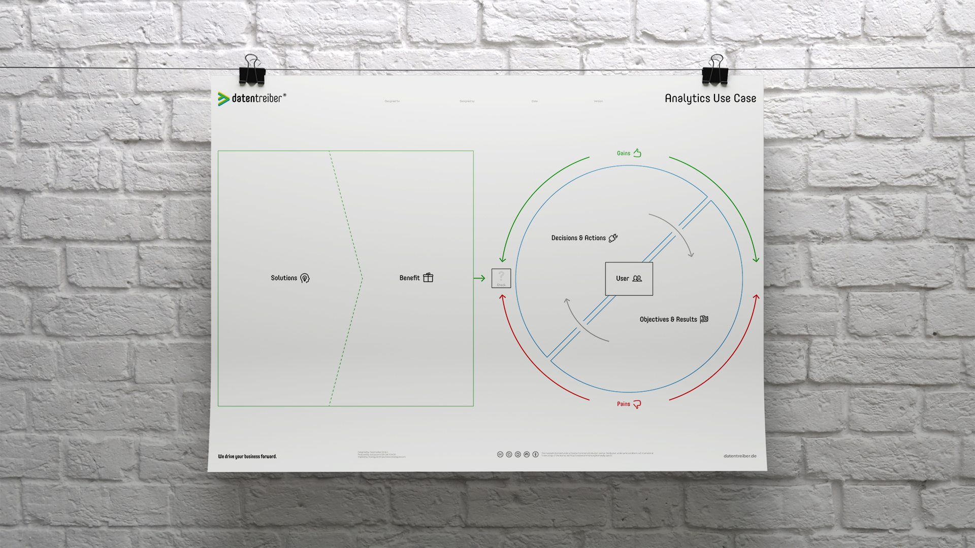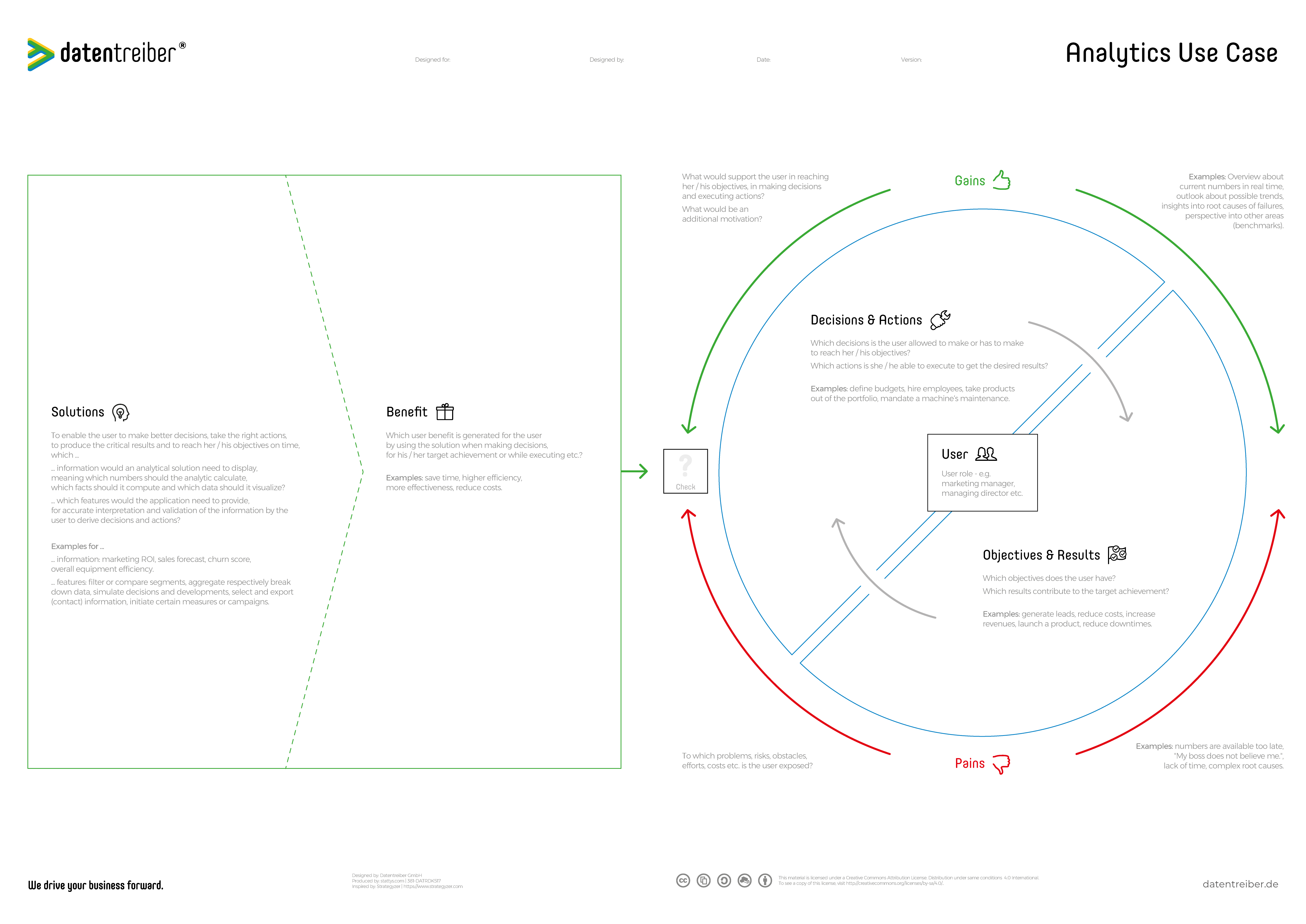
Analytics Use Case Canvas
Using the Analytics Use Case Canvas you can identify the pain points of your users and customers. It also allows you to conceptualize data and analytics solutions which provide real added value. Make use of the canvas to better understand the users and to critically reflect on your solution ideas regarding the problem solution fit.
We drive your business forward.
What Is the Analytics Use Case Canvas?
The Analytics Use Case Canvas is a tool for drafting analytical applications from a user’s point of view. This is what’s called a data product or in simple terms just analytics. An analytics use case can be defined by:
- Problem: who is the potential user of an analytical solution and which objectives does this person respectively this (user) role have? Which results contribute to reach these objectives, which decisions need to be taken to do so and which actions are possible? Which obstacles complicate or interfere with the target achievement and the decision making process? What could act as a support or motivation?
- Solution: which analytical solutions do exist and how do they look from a user’s perspectives? Which information and features does the user expect from the solution?
- Benefit: what is the added value of the solution for the user? And does the solution solve the user’s problem (at all)?
The Analytics Use Case Canvas helps to answer these questions. Hence it helps to ensure to conceptualize and develop data-driven products and internal analytics solutions which do we have a high user acceptance as well as a high value-added.
The Analytics Use Case Canvas is available for free under a Creative Commons license: you may use and modify the canvas as long as you cite Datentreiber in particular as the source.
We drive your business forward.

We drive your business forward.
How Do I Use the Analytics Use Case Canvas?
Many analytics projects fail due to lacking user acceptance and / or little added value. They’ve simply been developed without really targeting the user’s needs. The Analytics Use Case canvas helps you to better understand these needs. Subsequently, you can develop analytics solutions that really add value.
A use case is defined by providing answers to the following three questions:
- What’s the user’s problem?
- What’s the solution from the user’s perspective (not from a mere technical or analytical point of view)?
- What’s the solution’s benefit for the user?
Therefore, a use case describes the desirability of a solution.
In contrast, a business case answers the question regarding the viability on top of that. This also includes costs, risks, and the (financial) benefits of a solution. For this, the Business Model / Case Canvas can be used.
Looking at an analytics solution the benefit reveals itself by supporting, optimizing, or even completely automating (decision) processes to reach certain (business) objectives. Here analytics serves as a tool to get from data to relevant information which assists in setting the right course of action. Meaning deciding to go for those actions which deliver results which in turn contribute to reaching the objectives:
Data ➡ Analytics ➡ Information ➡ Decision ➡ Action ➡ Results ➡ Objectives
Hence, to design a value-adding analytics solution, we need to first understand a user’s objectives and key results (OKR). Furthermore, we need to examine which decisions and actions can be taken by the user respectively which he / she is allowed to take. Finally, we need to answer the question of what’s currently preventing the user to make better decisions (pains) and what would support him / her to take these (gains).
Only after that we can meaningfully think about the information and features an analytics solution needs to provide and what’s the (professional, personal and / or economical) benefit of all that. Subsequently, the Analytics Use Case canvas is divided into two parts:
- right-hand side: the problem / user view
- left-hand side: the solution / provider view
In the end, both sides must fit together which is either called problem-solution-fit or product-market-fit. Here the Analytics Use Case canvas follows the structure of the famous and successful Value Proposition Canvas.
Start
Step 1 of 6
User
Start with the right-hand side and put the analytics solution’s user in the middle (i.e. the field User). The user might be a concrete person or – most likely – a certain role or position in your company: for example, a marketing manager or a managing director. Use the blue cards (neutral color) for the user.
In case you are not sure who is going to be the user you can use the Stakeholder Analysis canvas to identify potential users, buyers, and decision-makers and to discuss them. Possibly there is more than only one user.
Alternatively, you can use the Business Model / Case Canvas: the Analytics Use Case Canvas is zooming into the Business Model / Case Canvas.
Step 2 of 6
Objectives and Results
Next, you discuss with your team, and ideally also with one or two potential users, the user’s desired objectives: what does he / she want to achieve? Which are the main (working) results which contribute to achieving his / her objectives? To do so it’s crucial to understand how the user’s performance is measured. To get this understanding the following artifacts can help:
- Agreements on objectives & labor contracts
- KPI / value driver trees (KPI: Key Performance Indicators)
- OKR lists (OKR: Objectives & Key Results)
Use blue cards to document the objectives and results.
Examples for objectives and results are:
- To generate a certain amount of leads by starting different campaigns.
- To increase a production facility’s efficiency by x % by reducing its unplanned and planned maintenance by y % and z %.
Step 3 of 6
Decisions and Actions
In the third step, based on the goals and results, you derive the decisions and actions that the user can make or perform. It is important here to understand what decision-making authority and scope of action the secondary user has to display to him / her the information that is relevant for his / her decision-making.
For this step, you also use the blue cards.
Examples for decisions and actions are:
- Which campaign should be started on which channel, addressing which target group?
- When should which machine be maintained?
Step 4 of 6
Pains
Turn now to the red cards and ask the question of which problems and risks the user is facing while achieving his / her objectives, reaching results, taking actions, and finding the best decisions. Which are the user’s efforts, costs, obstacles, problems, uncertainties, and so on, in short, the user’s pains which keep him awake at night? Place the corresponding red card close to the related objective, result, action, or decision.
Important: Scrutinize the pains by asking five times “why?”. The question “Why is that a problem?” works in both directions: What’s the problem’s root cause? What’s the problem’s (negative) consequence? Try to understand the problem’s root causes as well as possible in order to solve exactly those root causes, and not the symptoms, with the analytics solutions. However, you should also know about the negative consequences in order to be able to prioritize the problems according to their negative impact.
Examples for answers to the questions regarding the pains are:
- The source of the leads is not known because this information is not available in the CRM
- Outage risks of the production machinery in dependence on its lifetime is unknown because this has never been documented
Step 5 of 6
Gains
Next are the green cards. These represent the gains (incentives) that are desired by the user or even expected. Here it needs to be distinguished between so-called push and pull factors. Push factors have a supportive effect whereas pull factors have a motivational one.
Place the green cards just as the red cards (pains) close to the related decisions, actions, results, and objectives. Again, scrutinize the gains as well: why do they help the user?
Avoid that the gains only mirror the pains, meaning they only represent positive formulation i.e. the solution of the problem.
Examples for gains are:
- Performance benchmarks of the recent campaign comparing it to similar campaigns of the past
- Quick overview as well as detailed insights about past outages of the machinery
When finishing off with the right-hand side it’s recommended to discuss each and every single card once again, prioritize if necessary, and focus on the most critical and / or urgent objectives, results, decisions, actions, pains & gains. For this, you can use the Priority Matrix canvas. It’s really crucial that you and your team have a good and common understanding of the user.
Step 5 of 6
Solutions
Next, you are turning your attention to the left-hand side and think about potential (analytical) solutions. Most probably this will require some repetitions: first, you collect high-level solution proposals like:
- Weekly campaign report
- Real-Time KPI Dashboard
- Automated notification for low-performing campaigns
- Automated campaign optimization
- …
If the analytics maturity of the solutions differs substantially, e.g., a mix of descriptive and prescriptive analytics, you can use the Analytics Maturity canvas to sort the solutions according to their analytics maturity.
During the next repetitions you focus on one solution and further detail it:
- Which information does the solution provide? For example: number of leads per campaign and channel, ROAS (Return-On-Ad-Spending), …
- Which features does the solution have? Examples are: a segmentation of measures according to target groups, pausing of campaigns,…
Use blue cards for the features and the information.
Speaking from experience, it’s a good practice to use a flip chart on top of the canvas. This is to sketch the user interface as a first wireframe. Make it as concrete as possible.
Step 6 of 6
Benefit
Now think about the benefit for the user having the information and features of the solution in your mind. Place the respective proposals on green cards. Again, be honest to yourself and scrutinize the proposals: does this information or feature really provide this benefit? Why is it like that?
Examples for the benefit of an analytics solution are:
- Identify low-performing campaigns.
- Being able to better assess the risk of a machinery outage.
In case there is a lot of information and / or a high number of features that lead to an unclear value proposition, just switch over to the Value Curve Canvas: This one helps to focus on the essential features and their benefits.
Completion
As the last step, you compare the value proposition (left-hand side) to the user’s pains & gains (right-hand) side. Doing so you can, for example, mark all benefit cards which solve pain and / or bring gain by putting a tick on them. Furthermore, you can do the same for all pain and gain cards that are covered by the solution.
At the very end, you have an overview of how well your solution proposals cover the user’s needs. Subsequently, you can also compare different solution options against each other or combine them. In most cases, it will be a system of solutions that delivers the desired outcomes and success.
We drive your business forward.
Where Can I Find More Information?
Here you can find further documentation:
Entwickeln Sie nützliche Lösungen aus Anwendersicht (Blog)
Data Thinker Group (LinkedIn)
The Analytics Use Case Canvas is an adaption of Strategyzer’s Value Proposition Canvas adjusted for analytics applications.
We drive your business forward.
How Can I Start?
Seminars

Get to know our Data Strategy Design Method in our practical seminars:
- For beginners: Data Strategy & Culture
- For rising stars: Data Design Thinking
- For advanced designers: Data Business Consulting
Cross References

Here you can find further canvas and information concerning Data Strategy Design:
License Terms

You are free to:
Share — copy and redistribute the canvas in any medium or format
Adapt — remix, transform, and build upon the canvas
for any purpose, even commercially.
Under the following terms:
Attribution
ShareAlike
We drive your business forward.
Subscribe to our newsletter:
Receive all relevant blog articles, new seminar dates, special conference offers and much more conveniently by email. As a welcome gift, we will send you a link to download our Datentreiber design book (in German) and, for a short time, the article ” Data Thinking: mehr Wert aus Daten” in PDF form after your registration.
By clicking ‘Subscribe to our newsletter’ you agree that we process your information in accordance with our privacy policy.


